Designing a playful, ever-changing identity for an endlessly creative home cook
PROCESS HIGHLIGHTS
Tackling the Challenges and Shaping the Experience
Overview
M’san is a flexible homemade food brand from Indonesia, known for everything from hearty meals to cakes and cookies. The brand identity was designed to adapt so whether it’s "M’san Food" or "M’san Drink", it stays playful, personal, and easy to recognize.
Timeline
2024
Tools
Adobe Photoshop
Adobe Illustrator
Adobe InDesign
Responsibilities
Developed the branding concept and positioning.
Designed the visual identity: logo, colors, typography, and graphic elements
Created applications such as packaging and print collaterals

BACKGROUND
Homemade goodness with a personal twist.
The name M’san comes from the owner herself, a home cook with culinary training and a love for making all kinds of food. She can whip up regional dishes, Chinese meals, baked treats, or refreshing drinks, all under one roof. With affordability at its core, M’san was built to serve school kids, office workers, and everyday people looking for good food made with heart.
CHALLENGES
Cooking up a brand identity that sticks
The biggest challenge was flexibility. The brand needed to work across categories without losing recognition or charm. It had to feel cohesive on packaging, stickers, or social posts, while still being fun, approachable, and appealing to a wide audience on a modest budget.
DESIGN PROCESS
Design for all dishes, with one look.
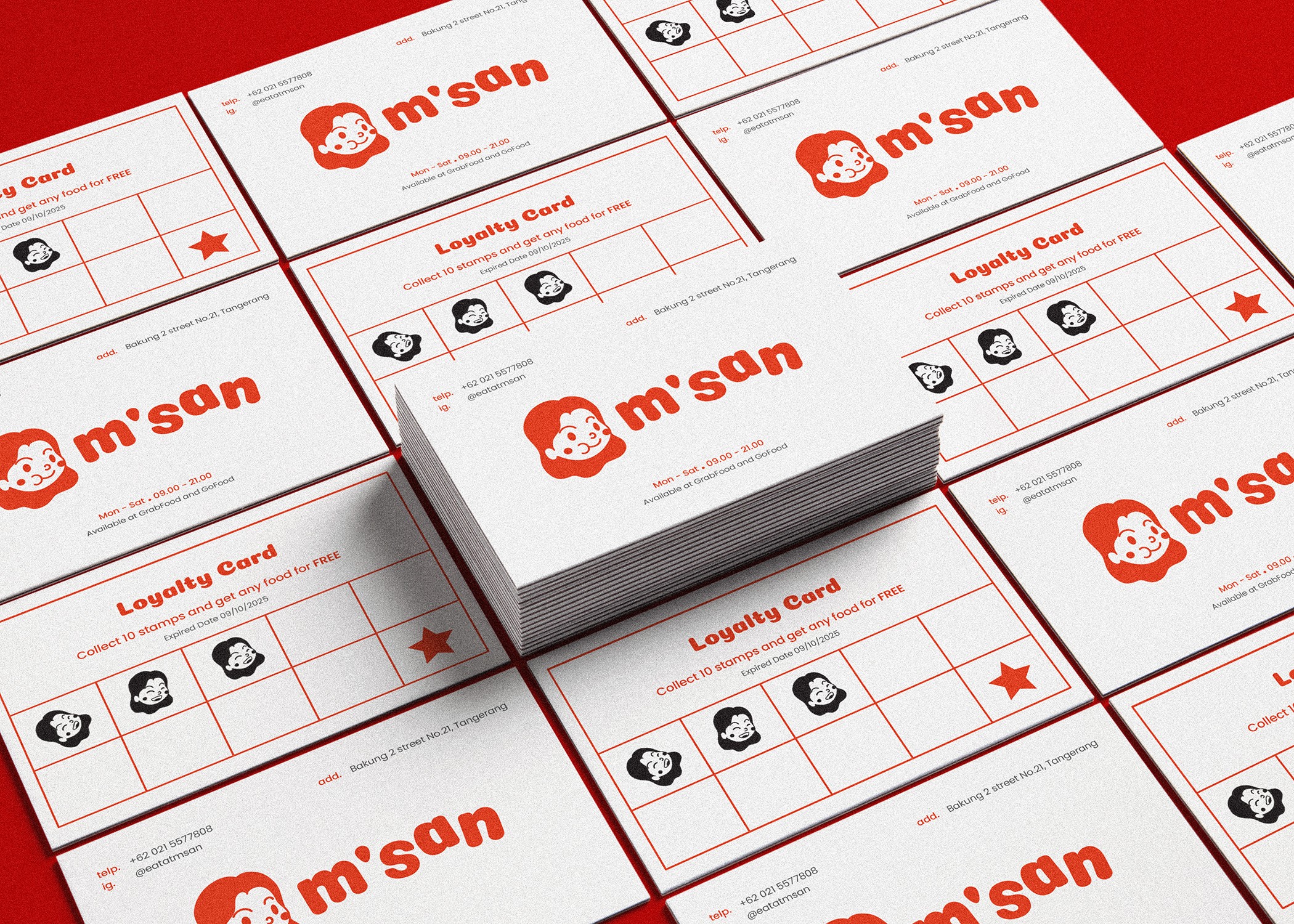
Logo
The logo reflects a cheerful, food loving woman, the heart of M’san. With playful face variations, it allows the brand to show personality and emotion across various formats. It’s both iconic and adaptable.
Color
The color palette features a vibrant red-orange paired with a sunny yellow and soft cream. This combo evokes energy, friendliness, and warmth

Typography
Coiny Regular gives a chunky, approachable tone for headlines, while Poppins keeps body text clean and readable, great for packaging, menus, or social posts.

To solve this, the identity focused on strong, character-driven visuals and a consistent but versatile design system. The flexible logo variations, bold colors, and simple layout system made it easy to apply across media, whether on a snack pack or a storefront poster.
The final result feels cohesive, fun, and instantly recognizable. It invites everyone, students, families, and workers to enjoy a brand that feels homemade and full of heart.


REFLECTION
Designing, Then Discovering
Previous Project