KAMPUNG LAWEYAN

Turning a forgotten cultural village into a visually engaging destination for a new generation of explorers.

KAMPUNG LAWEYAN

Turning a forgotten cultural village into a visually engaging destination for a new generation of explorers.

PROCESS HIGHLIGHTS

Tackling the Challenges and Shaping the Experience

Overview

Kampung Laweyan is a branding project that reimagines a historic batik village into a cultural destination for today’s generation. With deep roots in Solo’s heritage but little visual identity, the village needed a brand that felt alive something warm, textured, and ready to be explored.

Timeline

2021

Tools

Adobe Photoshop
Adobe Illustrator
Adobe InDesign
Blender

Responsibilities

  • Developed the branding concept and positioning.

  • Conducted primary research

  • Designed the visual identity: logo, colors, typography, and graphic elements

  • Created applications such as merchandise, signage, and print collaterals

  • Compiled the Graphic Standard Manual

BACKGROUND

Full of culture, but missing connection

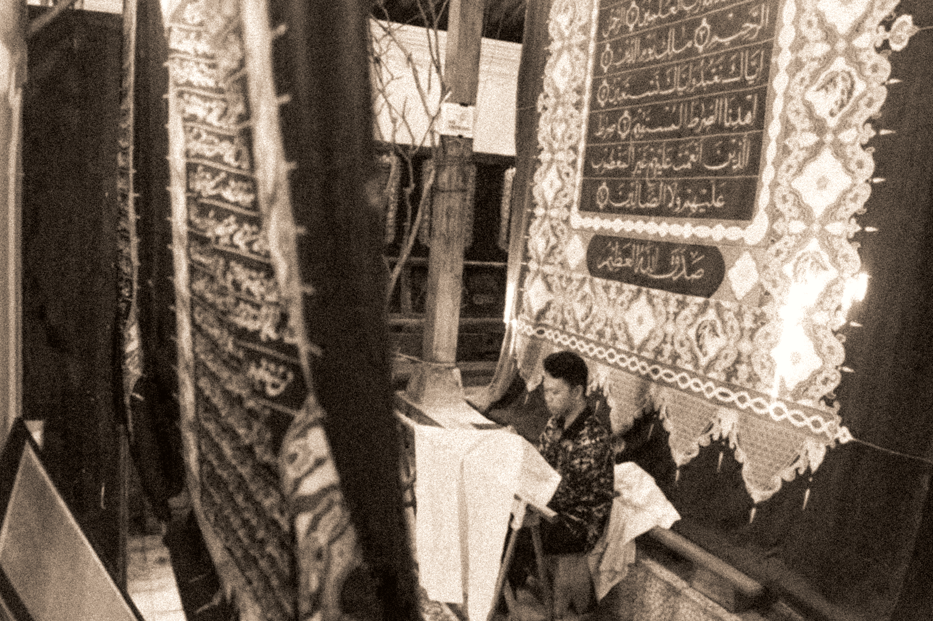
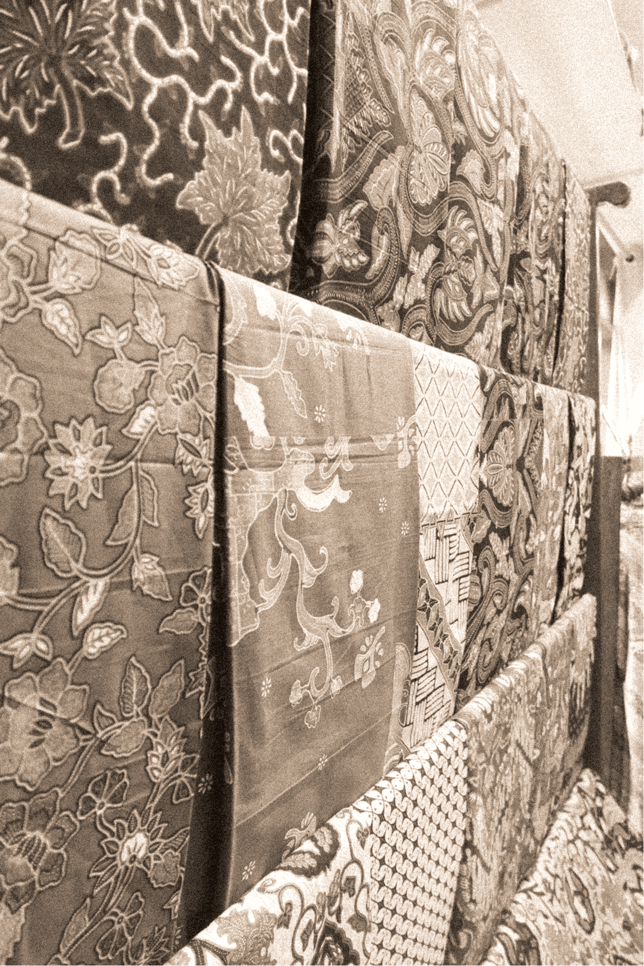
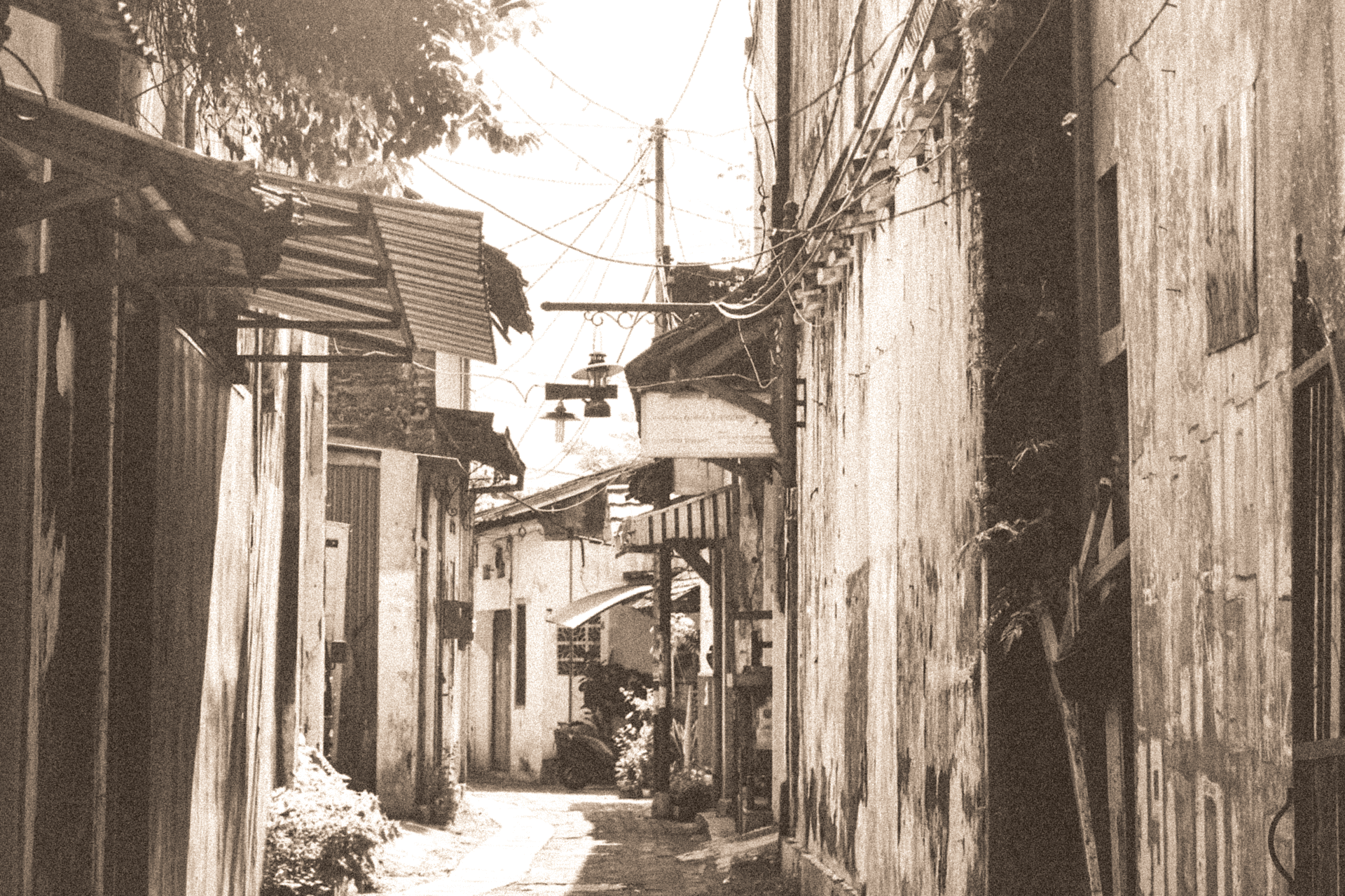
Kampung Laweyan is one of Solo’s oldest batik centers, rich with legacy and character. The homes, the handmade textiles, the atmosphere, it’s all there. But in the eyes of younger travelers, Laweyan had no voice. It struggled to compete with more popular destinations and lacked a brand that could reflect its charm in a way that resonates today.

What Laweyan needed wasn't just a logo, it needed a bridge, between past and present, between locals and visitors, between tradition and story. That’s where this project begins.

CHALLENGES

Making the timeless feel timely

The new generation not just want culture, but also clarity. A place that felt unique, but still shareable. Designing for that balance was the heart of the challenge. The visual identity had to feel respectful. It needed warmth, movement, and a sense of place that felt approachable without diluting the soul of Laweyan.

DESIGN PROCESS

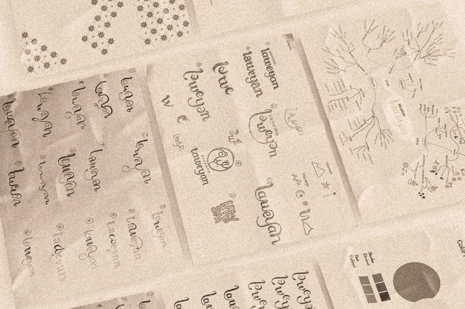
From Batik Village to Cultural Landmark

The visual language was inspired by Laweyan’s own story, its tight alleyways, flowing batik, and soft, modest spirit. The curves echo Javanese script, while the lowercase style reflects humility and harmony. Each shape connects like the people and stories within the village.

Color

Drawn from the textures of the village, quiet greens, warm tones, and a hint of gold to carry its charm forward.

Typography

The type system balances tradition and clarity, a character rich serif for titles, paired with a clean sans-serif for supporting text, echoing Laweyan’s mix of heritage and simplicity.
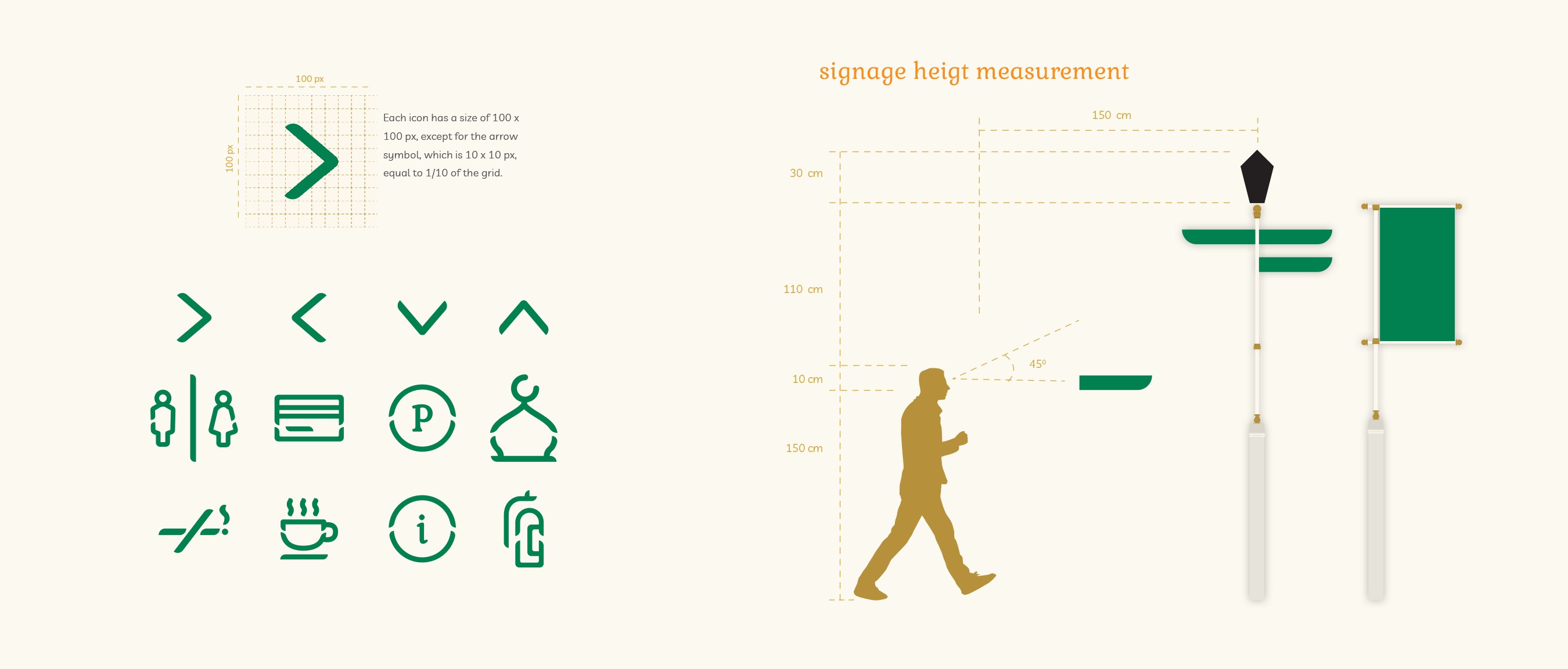
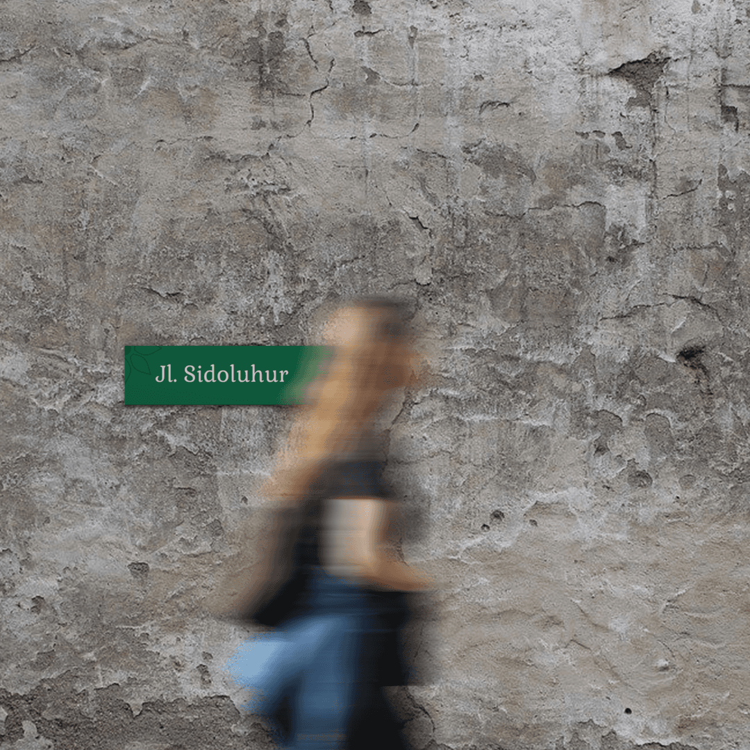
Sign System

Designed to guide visitors through Laweyan with ease, the signage blends local visual cues with practical readability. Inspired by old street plates and shop signs, it carries the identity in both form and tone welcoming, clear, and rooted.

Challenge: Avoiding clichés while working with cultural motifs. It was tempting to rely on common batik visuals, but that risked making the brand feel generic. I had to distill the spirit of Laweyan, not just its symbols, into a new visual language.


Solution: By layering in architectural textures, local slang, and youth culture references, the design became more contextual and unique.

Challenge: Appealing to Gen Z without losing Laweyan’s heritage. Younger travelers want share worthy aesthetics, but Laweyan’s soul lies in its quiet depth.


Solution: The identity kept vintage vibes but used bold layouts and color blocking to retain attention, mixing old with fresh in every visual decision.

Challenge: Avoiding clichés while working with cultural motifs. It was tempting to rely on common batik visuals, but that risked making the brand feel generic.

Solution: By layering in architectural textures, local slang, and youth culture references, the design became more contextual and unique.

Challenge: Appealing to Gen Z without losing Laweyan’s heritage.

Solution: The identity kept vintage vibes but used bold layouts and color blocking to retain attention, mixing old with fresh in every visual decision.

The final brand system offers a refreshing lens through which Laweyan can be seen, celebrating its vintage soul while speaking the language of modern youth. It sets the foundation for the village to build stronger connections with visitors and promotes sustainable cultural tourism.

REFLECTION

Designing, Then Discovering

This project showed me how design can shape perceptions of a place. By listening closely to the community and translating their stories into visuals, I learned how branding can be a tool for cultural preservation, not just aesthetic change.

It was also a deep dive into balancing personal design decisions with historical sensitivity. A reminder that good branding isn’t loud, it’s layered. If I could revisit the project, I’d love to explore environmental design, like animated signage, or interactive maps, that could’ve made the experience feel even more alive for first-time visitors.

This project taught me how technical animation, emotional design, and user interaction can blend into one cohesive experience. I learned to translate abstract problems like, “How can a chatbot feel human?” into practical, creative solutions.

It also sparked a deeper interest in the world of digital design, how they can work together to create engaging and human-centered experiences. This project made me want to explore more tech-driven design challenges in the future. Looking ahead, I’d love to explore more adaptive character behaviors, like visual cues that react to user tone or real-time sentiment or small emotional feedback loops to make future interactions feel more natural, expressive, and human.

Reach out, hop on,
and let’s see where this ride goes.
Reach out, hop on,
and let’s see where this ride goes.
Say hi!
yolanda.emmatyaa@gmail.com

Copyright © Yolanda Emmatya

Based in

Jakarta, Indonesia

Based in

Jakarta, Indonesia

Available for work

Freelance, Full-time