
PROCESS HIGHLIGHTS
Tackling the Challenges and Shaping the Experience
Overview
A self-initiated campaign design that empowers women to speak up against catcalling in public spaces. Initiated under The Body Shop’s values of ethical beauty and social justice, this project transforms urban fear into a statement of strength, through research driven visuals, strategic messaging, and bold storytelling.
Timeline
2021
Tools
Adobe Photoshop
Adobe Illustrator
Canva
Blender
Responsibilities
Campaign Concept
Research
Art Direction
Visual Design
BACKGROUND
It’s just a ‘hey beautiful’, until it isn’t
Catcalling is often dismissed as a joke or compliment, yet it leaves many women feeling unsafe, uncomfortable, and silenced. This campaign was born out of real frustration, not just mine, but shared by countless women in Indonesia. Using The Body Shop’s strong feminist positioning and ethical branding, I designed a campaign that reframes catcalling from "harmless fun" into what it truly is, verbal harassment. The goal? To help women reclaim confidence and shift public mindset.

CHALLENGES
Strong message, careful delivery required
One of the main challenges was visualizing catcalling without victimizing women or glorifying the aggressor. The topic is emotionally heavy, yet needed to be communicated clearly and powerfully. I also had to ensure the message aligned with The Body Shop’s tone, bold and feminist, yet responsible and empathetic. Translating raw, real emotions into respectful yet fierce visuals became the core task.
Find Solution
I began by digging deep through questionnaires, interviews, and field observations. Many women described stepping outside like walking into a battlefield, mentally preparing themselves with “weapons” like pepper spray or earphones. That powerful imagery sparked the campaign’s core idea, “Wherever I go, it should be like going down to the battlefield.”


Mindmap anda market segmentation

Creative Brief and AISAS
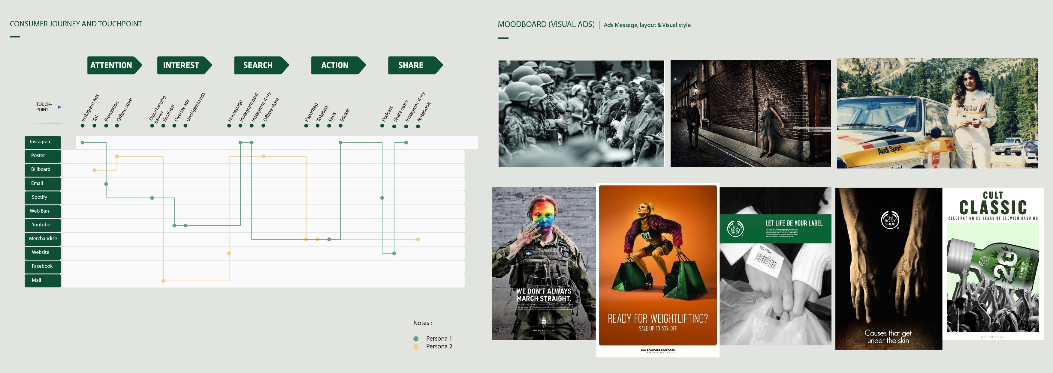
Consumer Journey and Moodboard
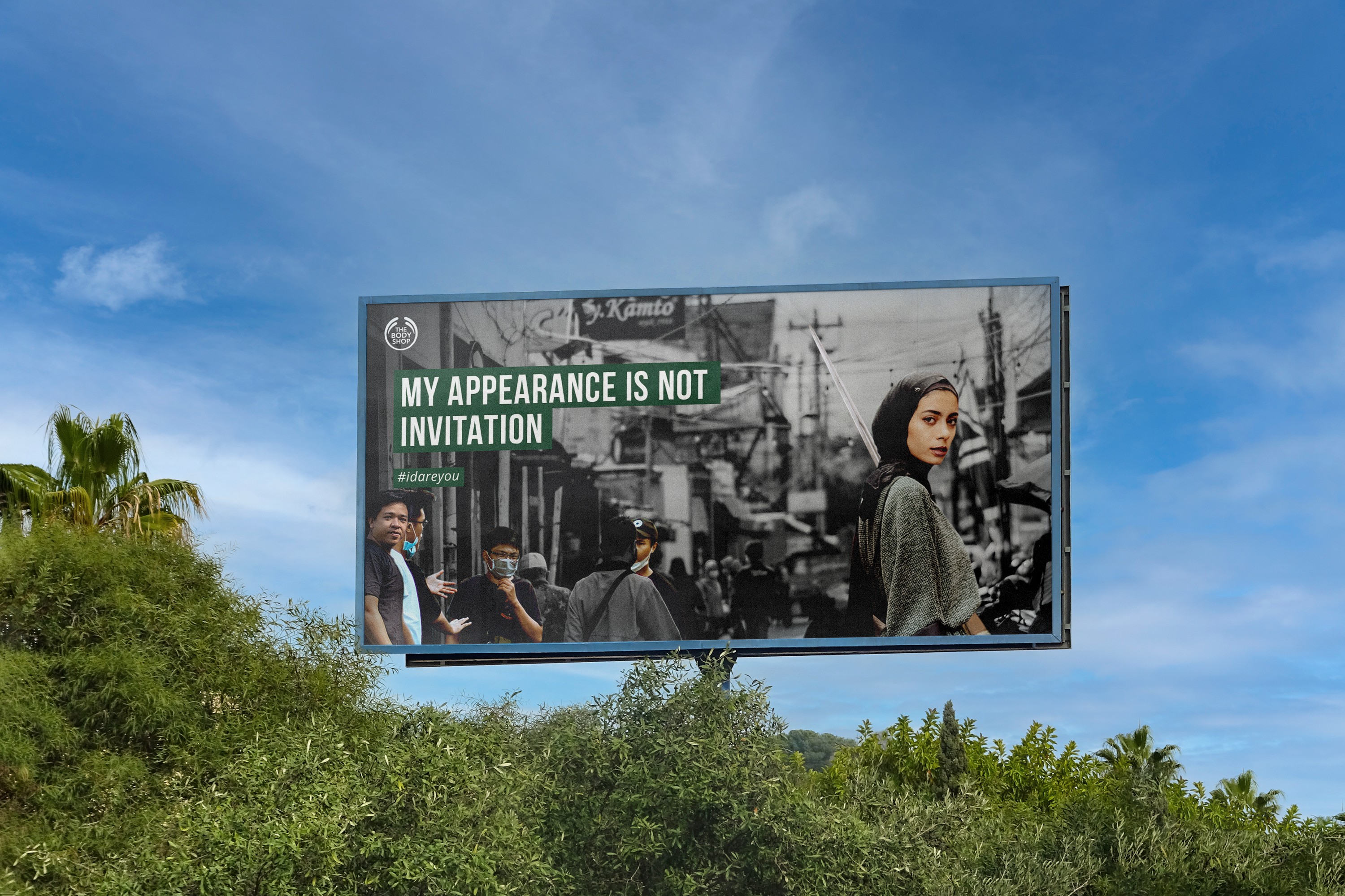
Using that insight, I created a concept where women appear powerful, unshaken, and in control. The visuals show models in feminine outfits combined with elements like taekwondo gear or baseball bats, symbolizing strength wrapped in confidence. They walk confidently through real-life settings where catcalling usually happens,bus stops, alleyways, roadside corners. Behind them, male figures shrink in intimidation, distorted like villains in a dystopian scene.

To keep brand alignment, the background uses monochrome tones inspired by The Body Shop’s campaign aesthetic. Photography and digital imaging were key in blending realism with conceptual storytelling. Quotes and empowering copy were embedded subtly into posters, packaging, and social media content to keep engagement high but direct.

This campaign dares to speak out where silence has long been the norm. It reflects real voices and lived experiences, told in a visual language that is both emotionally resonant and boldly artistic. Rather than making women look like victims, it shows them as resilient, prepared, and proud.
The design uses real environments and recognizable urban cues, making the message harder to ignore. And by partnering with a brand like The Body Shop, known for walking its talk, the message gains authenticity and reach.
REFLECTION
Designing, Then Discovering
Previous Project